How to Arrange Wall Decor Like an Interior Designer
Choosing the right pieces is only half the work. How you place them determines whether your wall looks designed or accidental. Arranging wall decor is a spatial skill, and like any skill, it follows learnable principles. Interior designers do not guess. They work from a system.
This guide gives you that system.
Start with the Wall, Not the Art
The most common mistake homeowners make is selecting art first and then trying to fit it onto the wall. Professional designers reverse this sequence.
Wall art arrangement begins with understanding the wall itself. Before you purchase or hang anything, assess the following:
Dimensions. Measure the full width and height of the wall. Note any architectural interruptions such as windows, doors, outlets, or light switches that will affect placement.
Anchor points. Identify the furniture or fixture that the wall decor will relate to. A sofa, a console table, a bed headboard, or a fireplace mantel all function as visual anchors. Your arrangement must feel connected to this anchor, not floating above it.
Light source. Natural and artificial light affects how art reads at different times of day. A piece that looks striking in morning light may disappear at night. Position high-value pieces where they receive consistent, favorable light.
The Rule of Eye Level (and When to Break It)
The standard guideline for how to hang wall art is to center the piece at approximately 145 to 150 centimeters from the floor. This corresponds roughly to average eye level and is the standard used in most commercial galleries.
In residential spaces, this rule applies well above sofas, consoles, and dining tables. The piece should sit 15 to 25 centimeters above the top of the furniture, close enough to feel related to it rather than disconnected.
The rule breaks intentionally in two scenarios. In stairwells, art follows the diagonal of the staircase at consistent spacing. In children’s rooms, art hangs lower to align with a child’s eye level. Both are deliberate departures, not mistakes.
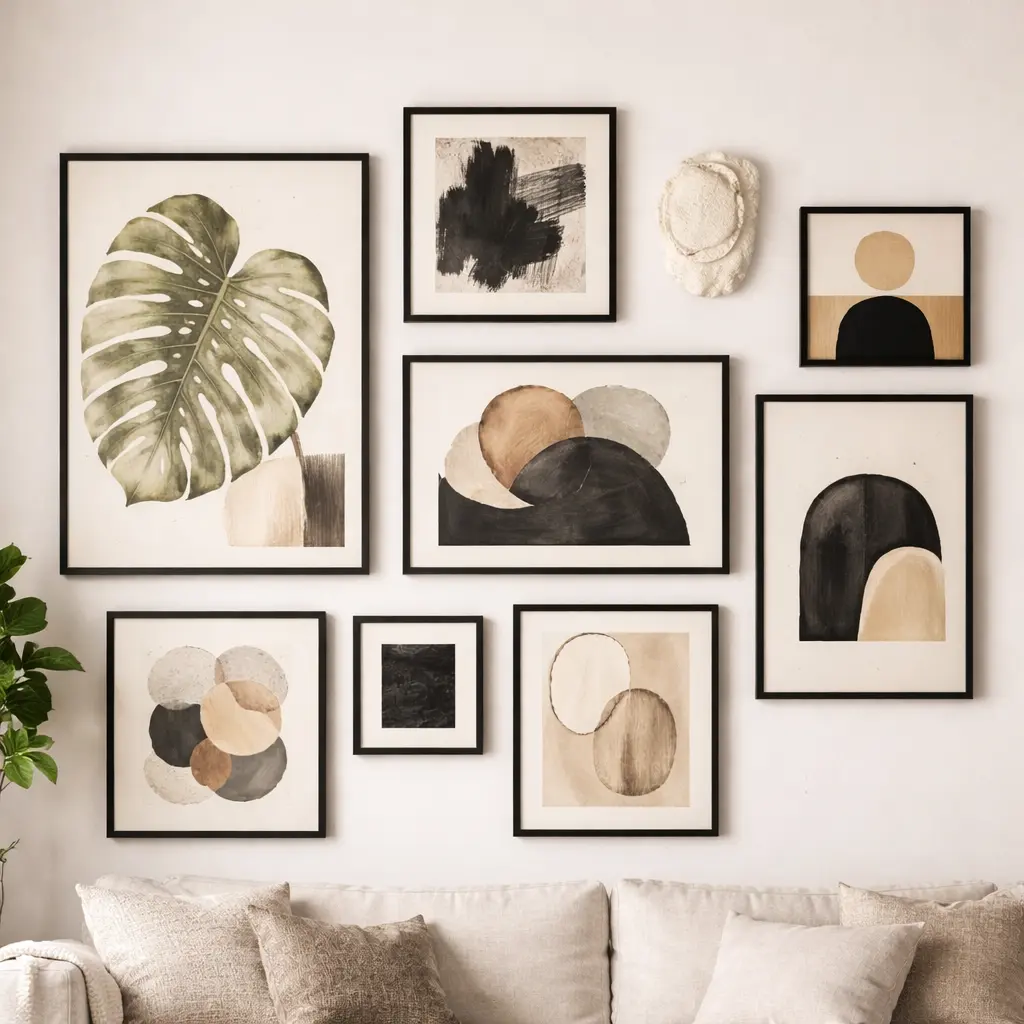
Building a Gallery Wall That Looks Intentional
Gallery wall ideas succeed or fail at the planning stage, not the hanging stage. Rushing to the wall without a plan is how you end up with a collection of holes and misaligned frames.
Follow this sequence:
Step 1: Gather your pieces. Lay every piece flat on the floor in the approximate shape of your wall area. This gives you a physical canvas to work with before committing to any holes.
Step 2: Find your anchor piece. In most gallery walls, one piece dominates. It is the largest, the most visually complex, or the one with the most personal significance. Place this piece slightly left of center or at the visual heart of the arrangement. Do not center it mathematically unless your layout is perfectly symmetrical.
Step 3: Build outward. Add pieces around the anchor, alternating between larger and smaller works. Maintain consistent spacing throughout, typically 5 to 8 centimeters between frames. Consistent spacing is the single most effective signal that a gallery wall was designed rather than accumulated.
Step 4: Test with paper templates. Cut kraft paper to the exact size of each frame. Tape the templates to the wall using painter’s tape. Live with the layout for a day before drilling a single hole. You will almost certainly adjust it, and adjusting paper costs nothing.
Step 5: Hang from the center outward. Once confirmed, hang the anchor piece first and build outward from it. This keeps your arrangement balanced through the process.
Mixing Frames, Sizes, and Mediums
One of the defining characteristics of modern interior design wall arrangements is the deliberate mixing of frames, scales, and mediums. The approach that looks effortless in a well-designed room is usually the result of careful constraint.
The most reliable mixing strategy is to unify one variable while varying the others. For example, use all black frames but vary the sizes and the content inside them. Or use all the same size frames but vary the frame finishes. One consistent element gives the eye a thread to follow through the variety.
Mixing mediums, such as framed prints alongside a mirror, a small sculptural element, and a wall-mounted plant, creates layered dimension that a flat gallery wall cannot achieve.
Spacing Logic for Standalone Pieces
For single pieces or small groupings outside of a gallery format, spacing logic is simpler but equally important.
A piece hung too high looks unmoored. A piece hung too low looks like it belongs on the furniture rather than above it. The 15 to 25 centimeter gap above anchor furniture is your reference point in almost every case.
For walls without furniture anchors, such as a hallway wall or a wall beside a window, aim to position the visual center of the piece at eye level and ensure it sits at least 30 centimeters from any adjacent door frame or corner.
The Final Check Before You Commit
Before drilling final holes, step back to the opposite end of the room or the farthest point from which the wall is normally viewed. This is the perspective that matters most. The arrangement should read clearly from this distance, with obvious balance and visual purpose.
Squinting slightly removes color and detail, leaving only composition. If the layout still reads well in this blurred view, the proportions and balance are correct.
For the foundational inspiration that informs your arrangement decisions, revisit our guide to modern wall decor ideas for every room. When you are ready to evaluate specific styles before purchasing, our guide to choosing the right wall decor style will streamline your decision.
🔥🔥🔥