How to Choose Wall Decor That Matches Your Interior Style
Choosing wall decor is not just about finding something you personally like. It is about selecting pieces that truly fit — artwork that speaks the same visual language as your furniture, lighting, color palette, and architecture. Most rooms that feel “off” are not missing more decor; they are missing alignment. This guide offers a clear, practical framework to help you make thoughtful, intentional decisions when selecting interior wall art.
Start With the Room’s Design Language, Not the Art
One of the most common mistakes people make when choosing interior wall art is shopping for art first and asking “Does this fit?” afterward. This approach reverses the correct order of decisions. Instead, begin with your room’s existing design language — the combination of its materials, proportions, color temperature, and furniture style.
Every interior sits somewhere between opposite qualities: minimal vs. layered, warm vs. cool, structured vs. organic, and traditional vs. contemporary. Before selecting artwork, identify where your room falls on each of these scales, then choose art that strengthens the room’s current character rather than working against it.
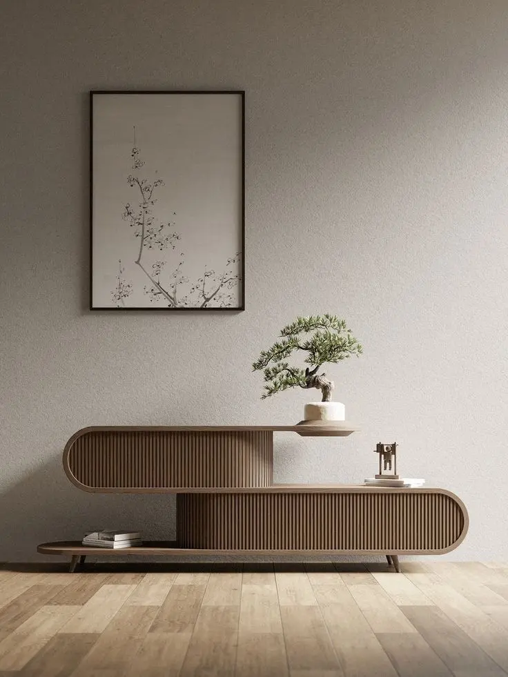
For example, a space with clean-lined furniture, warm wood tones, linen fabrics, and soft natural light reflects warm minimalism. It calls for art with space to breathe — one large piece, soft color palettes, and organic or abstract forms. Placing a bright neon pop-art print in that room would create visual conflict, and neither the room nor the artwork would benefit.
Match Wall Decor to Your Interior Style Category
Wall decor principles vary depending on your interior style. Here is a simple guide to aligning your choices with each main category.
Minimalist and Scandinavian Interiors
These spaces are defined by negative space, so your art should respect that openness. Rather than hanging many small pieces, choose one or two large artworks per room. Black-and-white photography, simple abstract line drawings, and monochrome canvases work especially well. Use thin frames in black, white, or natural wood, and either skip matting or choose a wide white mat to maintain a clean look. Avoid busy compositions, high-contrast colors, ornate frames, or anything that creates visual clutter.
Modern and Contemporary Interiors
Contemporary spaces can support bolder artwork, though boldness is not required. When matching wall art to furniture in modern rooms, focus on the room’s geometry. If your furniture features strong horizontal lines — such as low sofas or wide cabinets — choose artwork with a horizontal shape to reinforce that visual rhythm. Abstract paintings, geometric prints, and large-scale photography all work well in these settings. Frames in brushed metal, matte black, or frameless floating canvas styles blend naturally into modern interiors.
Bohemian and Eclectic Interiors
Bohemian spaces celebrate texture, layering, and a collected-over-time look. This is one of the few styles where mixing art styles, time periods, frame finishes, and materials is not only allowed but encouraged. Wall decor in boho interiors often includes woven hangings, textile art, macramé, and rattan-framed prints. Even in this relaxed style, one rule still applies: maintain color harmony. Keep a consistent color temperature — either warm earthy shades like terracotta, ochre, sand, and olive, or cooler tones such as sage, navy, and dusty rose.
Traditional and Classic Interiors
Traditional interiors often feature strong architectural details such as crown molding, panel doors, and symmetrical layouts. The artwork should respond to that structure. Symmetrical arrangements, oil-style paintings, botanical prints, and landscape art in gilded or dark wood frames are appropriate choices. Avoid placing clearly modern or digital-style artwork in a formal traditional space, as such mismatches create visual tension and weaken both the art and the room.
Industrial and Urban Loft Interiors
Industrial interiors are defined by raw materials like exposed brick, concrete, steel, and dark wood. In these spaces, artwork should add warmth without softening the room’s strong character. Black-and-white photography, vintage typography posters, abstract pieces in earthy tones, and oversized canvas prints are excellent options. Scale is especially important here — because industrial rooms often have high ceilings and large walls, small artwork can easily disappear without impact.
Use Color to Anchor or Contrast Your Wall Art
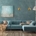
Color is one of the most powerful tools for integrating wall decor into a room. You can either anchor or contrast. Anchoring means selecting artwork that includes colors already present in the room — such as wall paint, furniture, or accent textiles — creating a cohesive and intentionally designed space. Alternatively, you can introduce a new color through artwork that does not appear elsewhere in the room. This approach works especially well in spaces that feel flat or neutral. A single bold piece with a strong or unexpected color can add energy without changing the entire room. The key is restraint: introduce only one contrasting color in one main artwork.
Match Frame Style to Furniture Finish
Frames should never be an afterthought. They act as the connection between the art and the room’s architecture. A poor frame choice can weaken even excellent art, while the right frame can elevate a simple print. As a simple rule, match the frame finish to the dominant metal or wood tone in the room. If your fixtures and hardware are brass, choose warm gold or honey-toned wood frames your room features matte black fixtures and dark furniture, black frames are a natural fit. If your space includes mixed finishes, choose a consistent frame profile — such as all thin frames — and vary the finishes slightly to create balance.
Scale and Proportion: The Non-Negotiable Rule in Wall Decor
Choosing wall decor ultimately comes down to scale before anything else. Artwork that is too small looks uncertain and unfinished. Artwork that is too large can feel overwhelming. A helpful guideline used by designers is that art or a gallery arrangement should cover about 60 to 75 percent of the available wall space, or roughly two-thirds of the width of the furniture beneath it.
When unsure, choose the larger option. The most common mistake in home wall decor is selecting pieces that are too small. What looks bold in a store or online often feels much smaller once placed on your wall surrounded by furniture and architecture.
After selecting your pieces, move to arrangement planning to position them with confidence. For more inspiration, explore wall art ideas tailored to each room in your home.
Pingback: Dining Room Wall Art Decor: 12 Ideas That Actually Work - New Home Essentials