Dining Room Wall Art Decor: 12 Ideas That Actually Work
Most dining rooms have one thing in common: a blank wall that’s been “temporary” for two years. Choosing dining room wall art decor feels harder than it should — because most advice tells you what looks good without telling you why it works or how to make it work in your specific space. This guide changes that. Whether you’re working with a formal dining room, an open-plan layout, a tight budget, or a wall the size of a billboard, you’ll walk away with a clear decision — and the confidence to execute it.
What Makes Dining Room Wall Art Different From Every Other Room
The dining room is the only space in your home where people sit facing your walls for 30–90 minutes at a time. That changes everything about how you choose art.
In a living room, people glance at walls between conversations. In a bedroom, art is viewed from a distance at rest. In a dining room, your guests study your walls — seated, at close range, under direct lighting, for an extended period. A piece that works casually in a hallway can feel jarring under that level of scrutiny.
This is why dining room wall art needs to do three things simultaneously: anchor the space visually, hold attention without overwhelming it, and complement the lighting conditions of a room that transitions from natural daylight to warm artificial light across a single meal.
Get those three right, and the rest is style preference. Get them wrong, and even expensive art feels off.
In a living room, people glance at walls between conversations. In a bedroom, art is viewed from a distance at rest. If you want a complete breakdown of how art strategy shifts from room to room, see our guide to wall art ideas for every room in your home.
How to Choose the Right Size Art for Your Dining Room
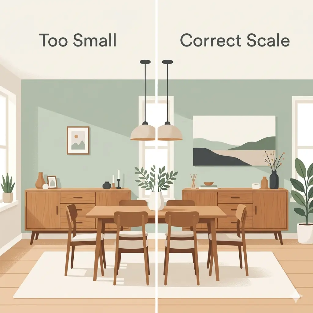
The single most common dining room decorating mistake is choosing art that’s too small. Once furniture fills the floor, walls look larger than they are — and undersized art floats, unmoored, like a Post-it note on a whiteboard.
Use this as your sizing baseline:
- Art above a dining table: Target a width of roughly two-thirds the length of your table. For a standard 72-inch table, that means aiming for art or a grouping spanning around 48 inches.
- Art above a sideboard or buffet: Select a piece that’s approximately 75% of the furniture width below it.
- Art on a bare wall (no furniture anchor): A single statement piece of 40–60 inches works well, or a gallery arrangement that fills the same visual footprint.
- Hanging height: Position the center of your artwork at 57–60 inches from the floor — this aligns with the average eye level for standing adults and remains comfortable from a seated position.
- Clearance from furniture: Leave at minimum 8–10 inches between the bottom of the frame and the top of any furniture below it. Less than that collapses the visual breathing room.
The 5 Art Styles That Work Best in Dining Rooms (and When to Use Each)
Not every art style performs equally in a dining room environment.
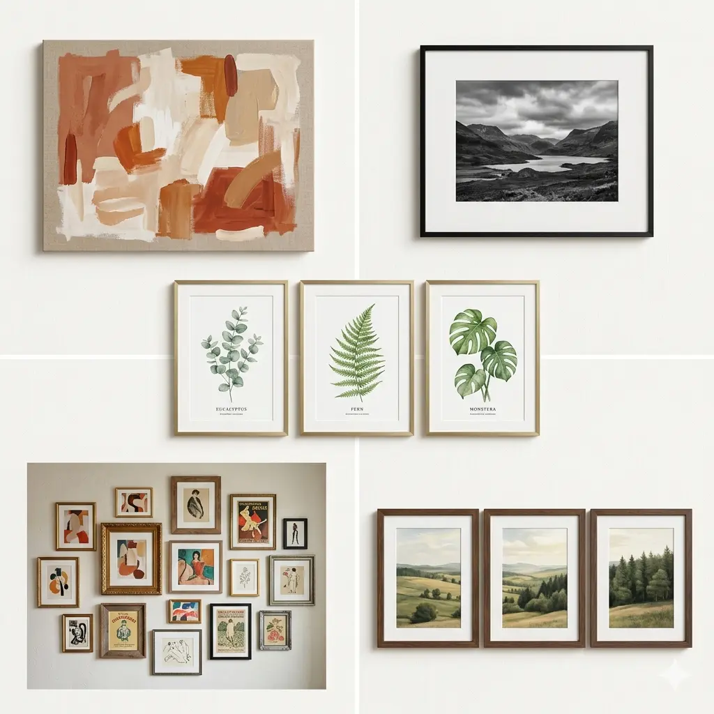
Here’s a direct breakdown:
| Art Style | Best For | Avoid If |
|---|---|---|
| Abstract canvas | Modern/contemporary dining rooms, minimalist furniture | You have very ornate, traditional furniture |
| Landscape photography | Neutral or transitional spaces; open-plan layouts | The room already has heavy pattern in rugs or upholstery |
| Black & white prints | Any room — this is the most universally safe choice | You want color warmth in a cold-toned room |
| Botanical / nature prints | Farmhouse, eclectic, cottagecore, maximalist spaces | Your space already features heavy green tones |
| Gallery wall (mixed) | Eclectic, personal, transitional styles | Formal dining rooms with symmetrical furniture layouts |
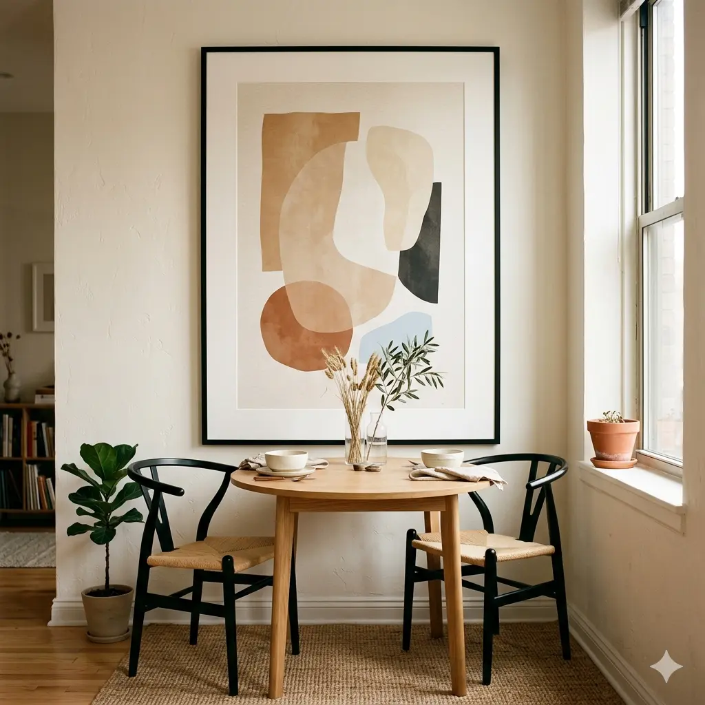
Abstract Art
Large-scale abstract pieces create instant focal points without competing with your furniture for visual attention. They work especially well in modern dining rooms with clean-lined tables and minimal overhead decor. When selecting an abstract piece, decide first whether you want it to pull from your existing palette or introduce a new accent color — both strategies work, but they lead to very different choices.
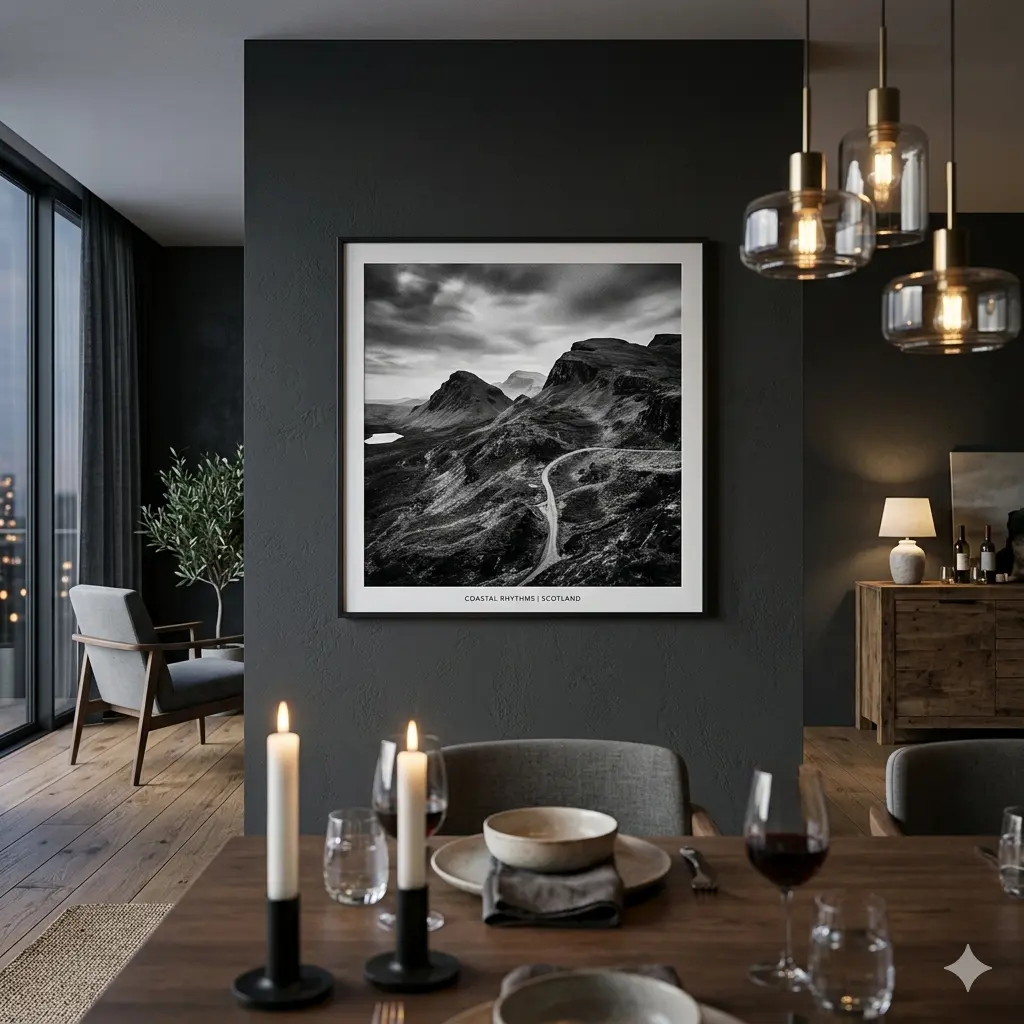
Black and White Art
Black and white wall art is the most forgiving choice in any dining room because it never clashes. It pairs with warm walls, cool walls, dark furniture, light furniture — the monochrome palette creates a neutral backdrop that harmonizes with almost anything. It also photographs well, which matters if you entertain and document those gatherings.
Botanical and Nature Prints
Botanical prints bridge the gap between traditional and contemporary styling. A set of three framed botanical illustrations in uniform frames works particularly well in farmhouse and transitional dining rooms. The organic subject matter softens spaces that feel too sleek or cold, and the variety within a series keeps the eye moving without creating visual chaos.
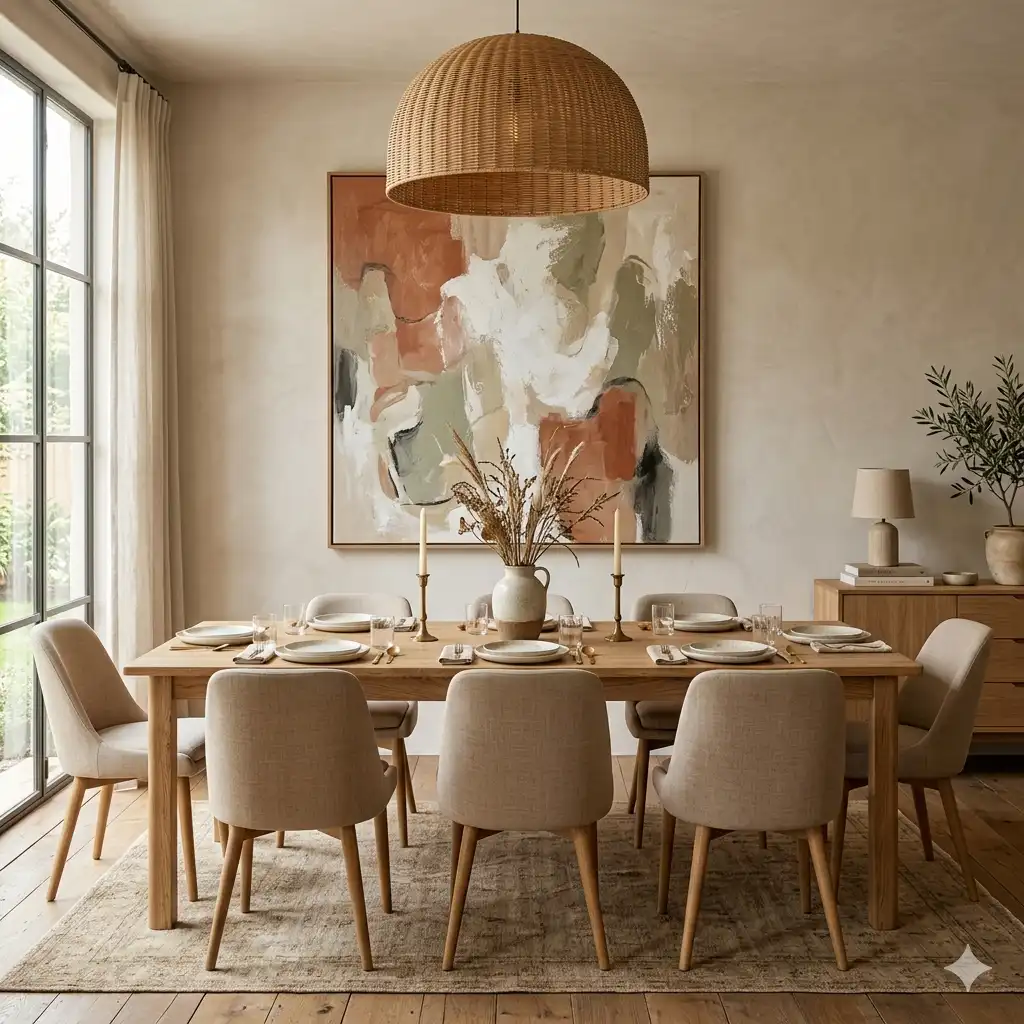
Landscape Photography and Triptychs
A landscape triptych — three related images presented as a horizontal series — creates a panoramic effect that mirrors the shape of a long dining table. This proportional echo makes it one of the most spatially intelligent choices available. It also functions like a window, visually expanding the perceived size of the room.
Gallery Walls
A gallery wall in a dining room works best with a clear organizing principle: either consistent framing (same frame style, different art) or consistent subject matter (different frames, related images). Without one anchor, gallery walls read as chaotic rather than curated. More on execution below.
Dining Room Wall Decor Beyond Framed Art
Framed prints are the obvious choice — but they’re not the only one, and sometimes they’re not the right one.
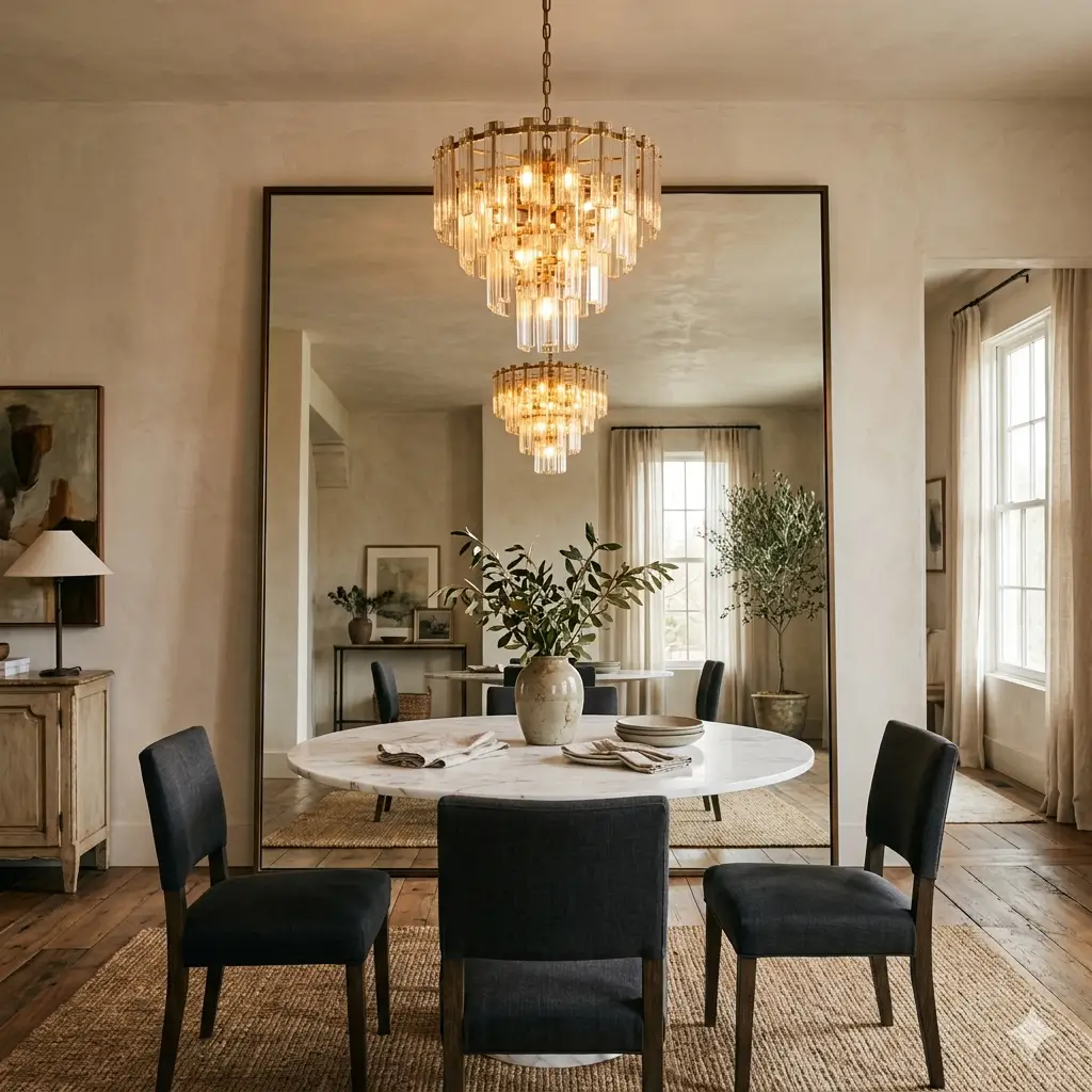
Oversized Mirrors
An oversized mirror on your dining room wall does something no artwork can: it reflects light, creates depth, and doubles the visual presence of a statement chandelier or pendant. In smaller dining rooms especially, a large leaning mirror can make the space feel significantly more generous. The catch is cost — a quality mirror of meaningful scale is an investment. Think of it as replacing three or four art pieces at once, because that’s effectively what it does for the wall.
Woven Wall Hangings and Textile Art
Textile art — macramé panels, woven wall hangings, fabric installations — adds texture that flat prints can’t. In dining rooms with smooth surfaces everywhere (glass table, lacquered chairs, painted walls), a textile piece introduces tactile contrast that makes the room feel more layered and lived-in. Particularly effective in bohemian, coastal, and Scandinavian-influenced spaces.
Sculptural Wall Decor
Metal wall art, wood relief panels, and dimensional sculptural pieces catch light differently at different times of day, which means they never look the same twice. This makes them especially interesting in dining rooms that see both daylight meals and candlelit dinner parties. The shadow play at night can be genuinely striking.
Wallpaper or a Mural Accent Wall
One wall treated differently from the rest — whether with bold patterned wallpaper, a hand-painted mural, or a scenic wall covering — functions as permanent art. This works exceptionally well in dining rooms where the “art wall” is the wall facing the table, meaning every seated guest looks at it for the duration of the meal.
How to Match Art Style to Your Dining Room Aesthetic
This is the section most guides skip entirely — and it’s where most decorating mistakes happen.
Modern and Contemporary
Stick with large-scale abstracts, geometric prints, and black and white photography. One oversized canvas outperforms a gallery arrangement in modern spaces — more negative space reads as intentional sophistication.
Traditional and Formal
Classical landscapes, portrait-style prints, and vintage botanical illustrations. Symmetry matters here: two matching pieces flanking a central element, or a single centered work above a symmetrical sideboard. Frames should be substantial — gilt, dark wood, or wide matting.
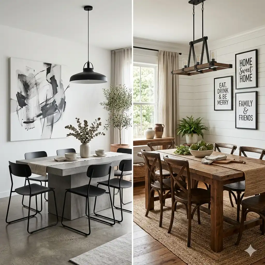
Farmhouse and Rustic
Typography prints, shiplap-inspired framing, black metal frames with white or warm-toned art. Series of three work well. Avoid anything that looks too polished or high-gloss — rough edges and imperfect textures are features, not flaws.
Bohemian and Eclectic
This is the one style where more rules can be broken. Layered gallery walls with mismatched frames, textile pieces alongside framed prints, earthy tones and organic shapes. The guiding principle: intentional eclecticism, not accidental clutter. Every piece should feel chosen, not defaulted to.
Coastal and Organic
Soft blues, sandy neutrals, landscape photography, abstract ocean-inspired pieces. Frames in natural wood, white-washed finishes, or matte black. Avoid anything that feels too tropical-kitsch unless that’s your deliberate intent.
This is the section most guides skip entirely — and it’s where most decorating mistakes happen. For a deeper framework that goes beyond the dining room, our full guide on how to match wall decor to your interior style covers every aesthetic in detail.
The Lighting Factor: What Most Guides Don’t Tell You
Your dining room likely has two or three distinct lighting conditions across a single day: morning natural light, afternoon indirect light, and evening artificial light from overhead pendants or a chandelier. Your wall art needs to work in all of them.
High-gloss canvas finishes cause significant glare under pendant lighting, especially when positioned directly across from windows or below recessed spotlights. For dining rooms with overhead lighting directly in front of the art wall, matte finishes or satin canvas consistently outperform gloss.
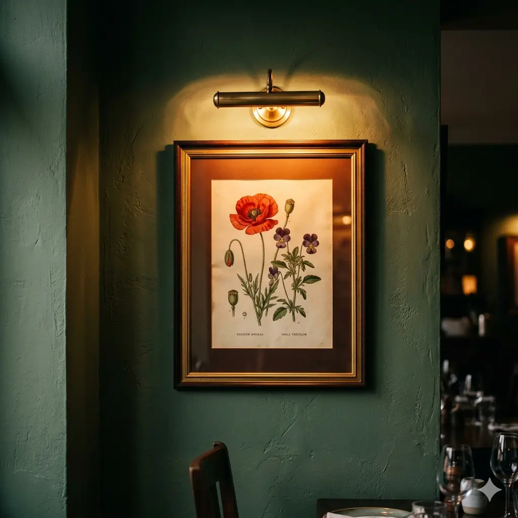
Art lighting — a dedicated picture light mounted on or above the frame, or recessed directional spotlights aimed at the art — elevates even a modest print to gallery quality. This is one of the highest-ROI moves in dining room design and one of the most frequently overlooked. A warm-toned bulb (2700K–3000K) enhances most art finishes without the harsh, clinical effect of cool white light.
Dark walls require higher-contrast art — pieces with more white space or bold graphic elements. On dark walls, delicate pastel prints disappear. Conversely, on bright white walls, you have the most flexibility — almost any style reads clearly.
Get those three right, and the rest is style preference. Get them wrong, and even expensive art feels off. For a broader look at how wall art transforms a modern home interior, including the psychology behind it, we’ve covered that in depth separately.
How to Create a Gallery Wall in a Dining Room: Step-by-Step
Gallery walls work in dining rooms, but they require more planning than a single statement piece.
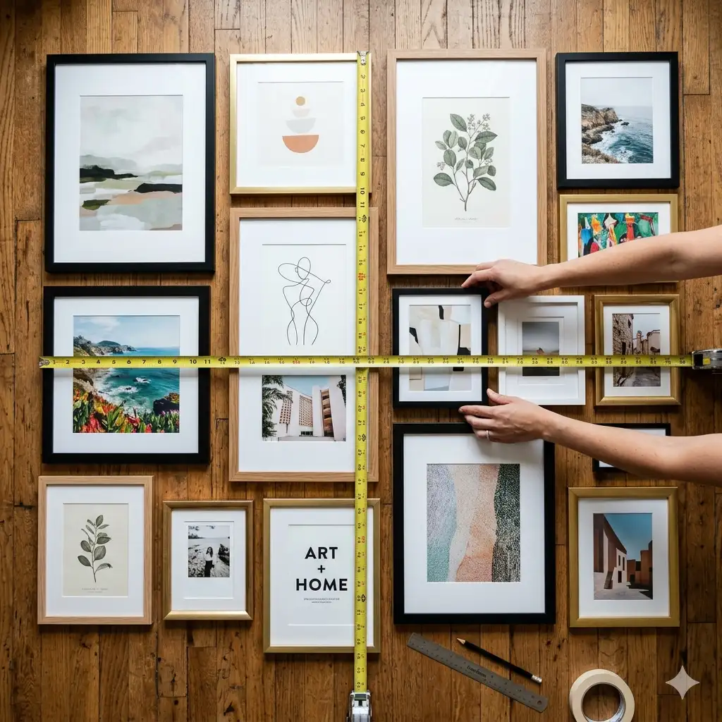
Follow this process:
- Choose your organizing principle first. Consistent frames with varied art, or consistent subject with varied frames — pick one. Mixed-everything gallery walls require a very high level of curation skill to avoid chaos.
- Lay everything out on the floor before anything goes on the wall. Arrange, step back, photograph it, adjust.
- Establish your centerpiece — the largest or most visually dominant piece — and build outward from it.
- Maintain consistent spacing between frames: 2–3 inches between smaller pieces, up to 4 inches maximum. Inconsistent gaps are the most common gallery wall execution error.
- Use paper templates cut to the exact size of each frame. Tape them to the wall, live with the arrangement for a day, then commit and hang.
- Keep the bottom edge of your lowest frame at least 8–10 inches above the top of any furniture below the arrangement.
Budget Guide: What to Expect at Every Price Point
Not all wall art is created equal — and neither are all budgets.

Here’s what’s realistic:
| Budget Range | What You Get | Best Sources |
|---|---|---|
| Under $50 | Digital prints in affordable frames, poster art | Etsy digital downloads, IKEA frames, Amazon |
| $50–$200 | Ready-made canvas prints, framed photography sets | Society6, Minted, Target, Urban Outfitters |
| $200–$600 | Higher-quality canvas prints, limited edition prints, quality framing | Minted, Artifact Uprising, independent artists |
| $600–$1,500 | Original small works, high-end limited editions, quality oversized prints | Local galleries, Saatchi Art, Artfinder |
| $1,500+ | Original paintings, investment-grade art, oversized originals | Established galleries, auction platforms |
The highest-leverage budget move at any price point: invest in better framing. A $40 print in a $120 frame consistently outperforms a $120 print in a $40 frame. The frame isn’t decoration — it’s architecture.
Common Dining Room Wall Art Mistakes (and How to Avoid Them)
Hanging art too high. The instinct is to push art toward the ceiling. Resist it. Eye level (57–60 inches to center) is the standard for a reason — it creates connection, not distance.
Choosing art that’s too small. Already covered, but worth repeating: when in doubt, go one size larger than you think you need.
Ignoring the seated viewing angle. Sit at your table and look at the wall before you commit to any placement. What you see from that angle is what matters — not what you see walking in.
Matching too precisely. Art that matches the room’s exact color scheme to the letter looks designed, not curated. Pull one or two colors from the room into your art selection, not all of them.
Forgetting scale relationships. Art doesn’t exist in isolation — it exists in relation to your table, your chairs, your chandelier, and your ceiling height. A piece that looks right in the store can feel completely wrong when surrounded by your specific furniture.
You can read more on interior design proportions and wall art placement
Dining Room Wall Art for Small Spaces
Small dining rooms require a different strategy — not necessarily smaller art.
A single large statement piece in a small dining room creates depth and draws the eye outward, making the space feel larger. A collection of small pieces in a small dining room creates visual clutter that makes the space feel compressed. This is counterintuitive but consistently true.
The exception: a vertical series of two or three narrow pieces mounted close together reads as a single tall element, which draws the eye upward and creates a sense of ceiling height.
Mirrors, as mentioned, are particularly powerful in small dining rooms — their reflective quality doubles the perceived depth of the space.
Conclusion: The Fastest Way to Choose Your Dining Room Wall Art
The decision framework is simple: start with your wall size (use the two-thirds rule), match your style aesthetic to the art category table above, eliminate high-gloss finishes if you have overhead lighting, and buy larger than your instinct tells you.
The most common outcome of this guide should be: you stop overthinking it and start hanging.
If you’re still undecided between two options, choose the one that would spark a conversation at dinner. That’s ultimately what dining room art is for — not just to fill a wall, but to make the room feel like it has something to say.
Frequently Asked Questions About Dining Room Wall Art Decor
Q1: What size wall art is best for a dining room?
The best size for dining room wall art depends on your wall and furniture dimensions. For art above a dining table, aim for a width that covers roughly two-thirds of the table’s length — so a 72-inch table calls for art spanning around 48 inches. For art above a sideboard, choose a piece that is approximately 75% of the furniture’s width. When in doubt, go one size larger than your instinct — undersized art is the single most common dining room decorating mistake.
Q2: What type of art looks best in a dining room?
The most consistently successful choices for dining rooms are large-scale abstract canvases, black and white photography, botanical print series, and landscape triptychs. Black and white art is the safest universal option because it complements any wall color, furniture finish, or lighting condition without clashing. If you want to introduce color, pull one or two tones from your existing palette rather than introducing an entirely new color family.
Q3: How high should you hang art in a dining room?
Hang dining room wall art so the center of the piece sits between 57 and 60 inches from the floor — this aligns with average standing eye level and remains comfortable from a seated position at the table. If your art hangs above a sideboard or buffet, maintain at least 8 to 10 inches of clearance between the bottom of the frame and the top of the furniture. The most common mistake is hanging art too high, which creates visual disconnection from the rest of the room.
Q4: Can I use a mirror instead of art in my dining room?
Yes — and in many dining rooms an oversized mirror outperforms framed art entirely. A large mirror reflects light, creates depth, doubles the visual presence of a chandelier or pendant, and makes the room feel significantly larger. This makes mirrors especially powerful in smaller dining rooms or spaces with limited natural light. The trade-off is cost — a quality oversized mirror is a higher investment than most prints, but it functionally replaces multiple art pieces at once.
Q5: How do I choose dining room wall art that matches my interior style?
Start with your room’s existing design language before shopping for art. Modern and contemporary dining rooms suit large abstract canvases and monochrome photography. Traditional spaces call for classical landscapes, botanical illustrations, and symmetrical arrangements with substantial frames. Farmhouse and rustic rooms work well with typography prints and series of three in black metal frames. Bohemian spaces have the most flexibility — the only rule is that every piece should feel intentionally chosen. For a complete style-matching framework, see our guide on how to match wall decor to your interior style.